
MY ROLE
UX Research, User Flows, Sketching, Wireframing, Visual Design, Prototyping, Usability Testing
TOOLS: Adobe XD, InVison, Miro DURATION: 5 Days
A Recipe App Using The Google Ventures Design Sprint Method
Savr is a new startup that shows hundreds of recipes, and cooking tips for at-home chefs. They have an active community of users who rate and review recipes for others.
The goal for this project was to help alleviate the biggest stresses when cooking a meal so that home chefs can easily prepare and follow along with processes to feel confident when following a recipe.
DAY 1: MAP
THE PROBLEM AT HAND
Savr gets a lot of positive feedback on the quality of their recipes, but they need to help users accurately, and easily follow the cooking instructions.
Recently, Savr has seen some negative reviews about recipes that involve many steps, or more advanced techniques. Many people who were excited about a certain recipe end up disappointed with the outcome, because they didn't feel the instructions were clear, or easy to execute.
UNDERSTANDING USER BEHAVIORS
I asked at-home chef's to "Tell us about your experience cooking a recipe for the first time" and here are some of the highlights.
"I can see what the finished project looks like, but I don't know if I'm on the right track halfway through."
-Dan
"I try to be as efficient as possible with how many pots and pans I am using. There are a lot of times when I have to hand wash something half way through."
-Ron
"I don't enjoy emptying my cabinets because I don't know what kitchen-ware I need, or constantly needing to wash my hands so I can refer back to my phone."
-Maria
"I know the basic definitions - like what minced garlic looks like. But a lot of times I see techniques that I am totally unclear on. I YouTube it, which kind of throws everything off and, means I need to drop everything and use my phone."
-Sara
WHAT DID THIS REVEAL?
Users seem to want more information on the prep work & kitchenware up front so they can be more efficient. Users would like to see in progress shots of the recipe at various steps to give them feedback that they are doing things correctly and are on the right track. Users might like an outline of the process beforehand so they can have everything prepared and organized as needed. Users want to be efficient with their time so make sure the instructions allow you to eliminate any down time when possible while cooking. If there are multiple parts of the meal people want to know how long things take and want to make sure they finish at the same-ish times. Users want to see examples of advanced techniques or links to images or show them in the process.
WHO AM I DESIGNING FOR?
With all the data collected from user interviews I was able to develop this persona.

Nikki, 29 Years old
BEHAVIOR
Nikki cooks about three nights a week, usually for herself, but sometimes for her and her boyfriend.
She likes tweaking or improving certain recipes, but she doesn't feel comfortable improvising until she has cooked it "by the book" once.
FRUSTRATIONS
Sometimes Nikki is unsure if she is on the right track part way through preparing a meal.
Nikki gets really stressed out trying to refer back to her phone every time a new step or technique is introduced.
GOALS
To follow a recipe easily and confidently, so the dish comes out as expected.
Nikki wants trying new recipes to be enjoyable and challenging - not stressful and chaotic.
MAPPING THE END-TO-END USER EXPERIENCE

DAY 2: SKETCHING
LET’S FIND A BETTER SOLUTION TO ALL THIS
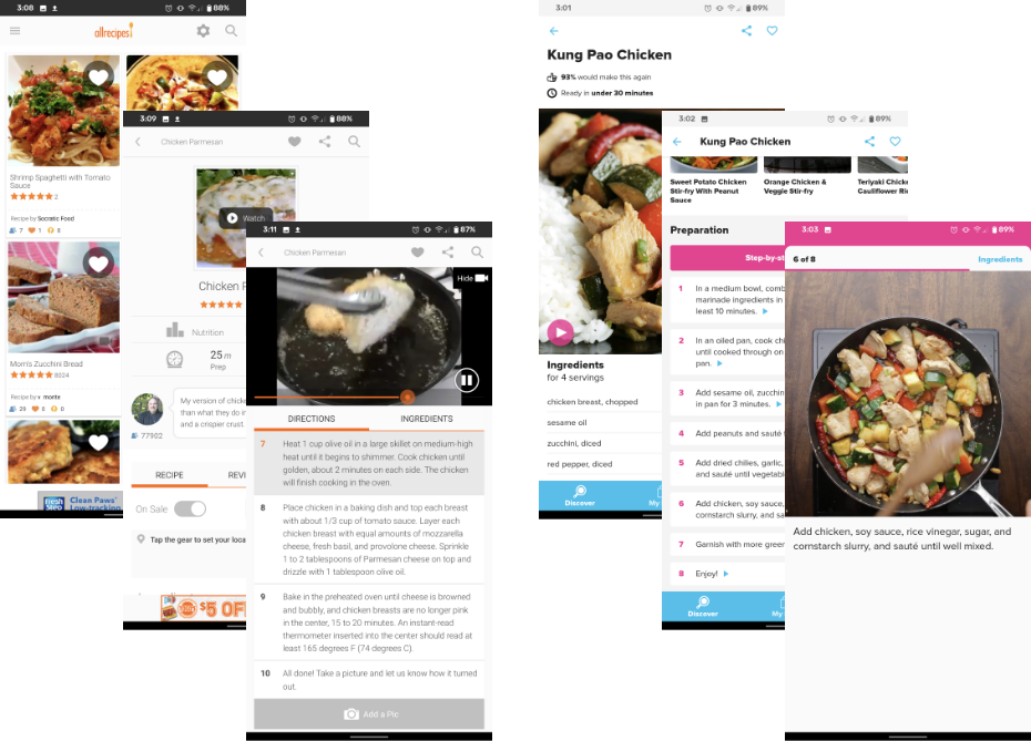
From here it was time to see what other solutions I could come up with. For this step I looked to other recipe apps for inspiration and to see how they functioned. As a bit of an amateur chef myself, I thought about what I want to see from the apps I already use when I am looking for a new recipe. The in-process videos were something I wanted to include as they help reassure me that I am on the right track as I go. One feature that I found in my research that was really interesting was the voice commands that let me talk to the app like I would to my Alexa already. I thought that was so neat and was an instantly included feature in my design. Allrecipes and Tasty both had really clear written instructions so I made sure the way Savr's instructions were written were similar.
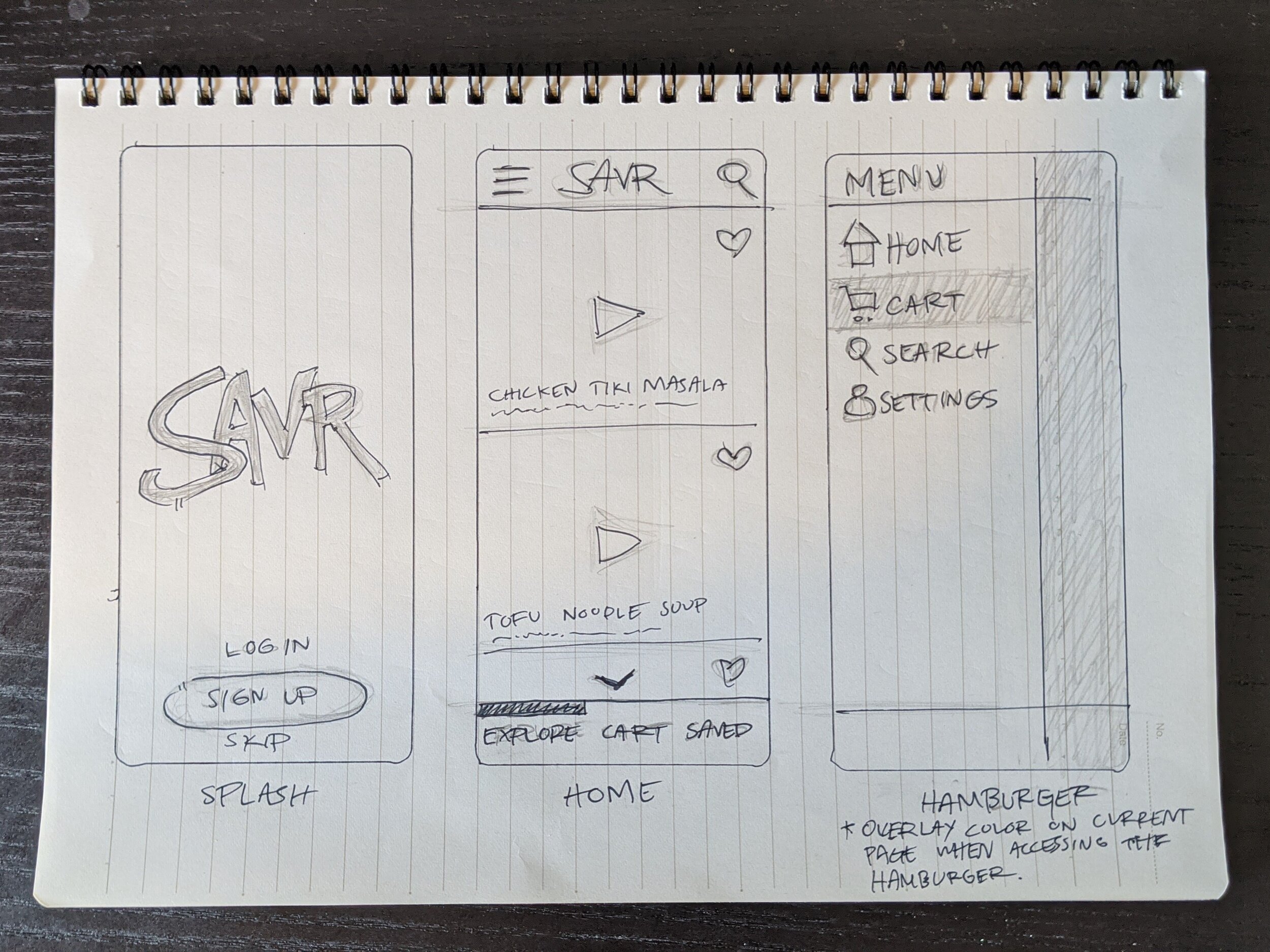
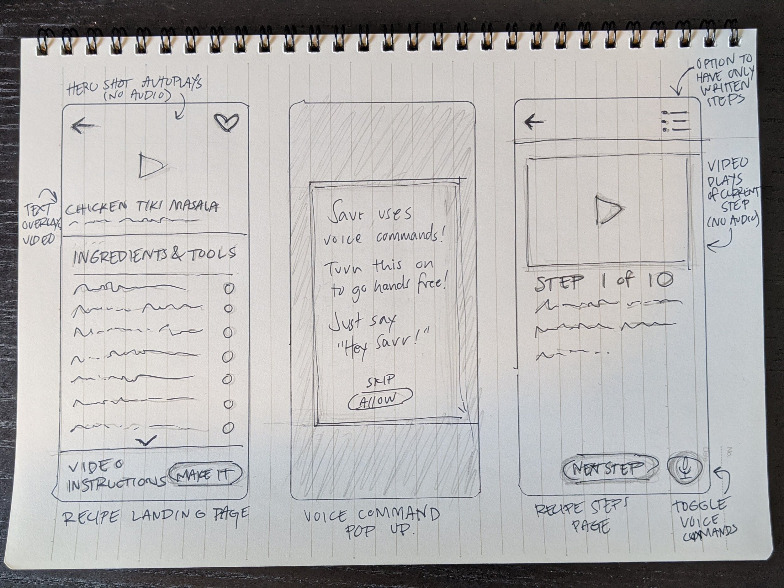
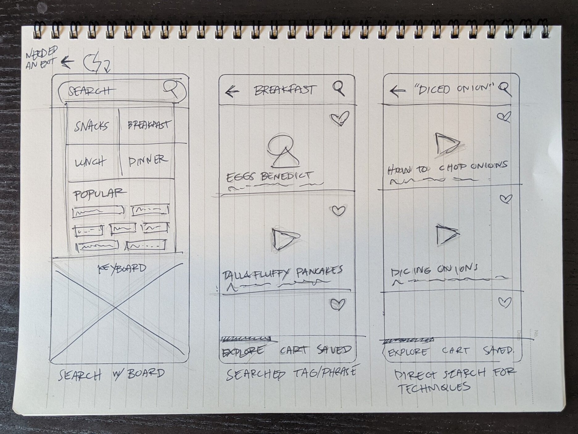
PUTTING THE PEN TO THE PROVERBIAL PAPER
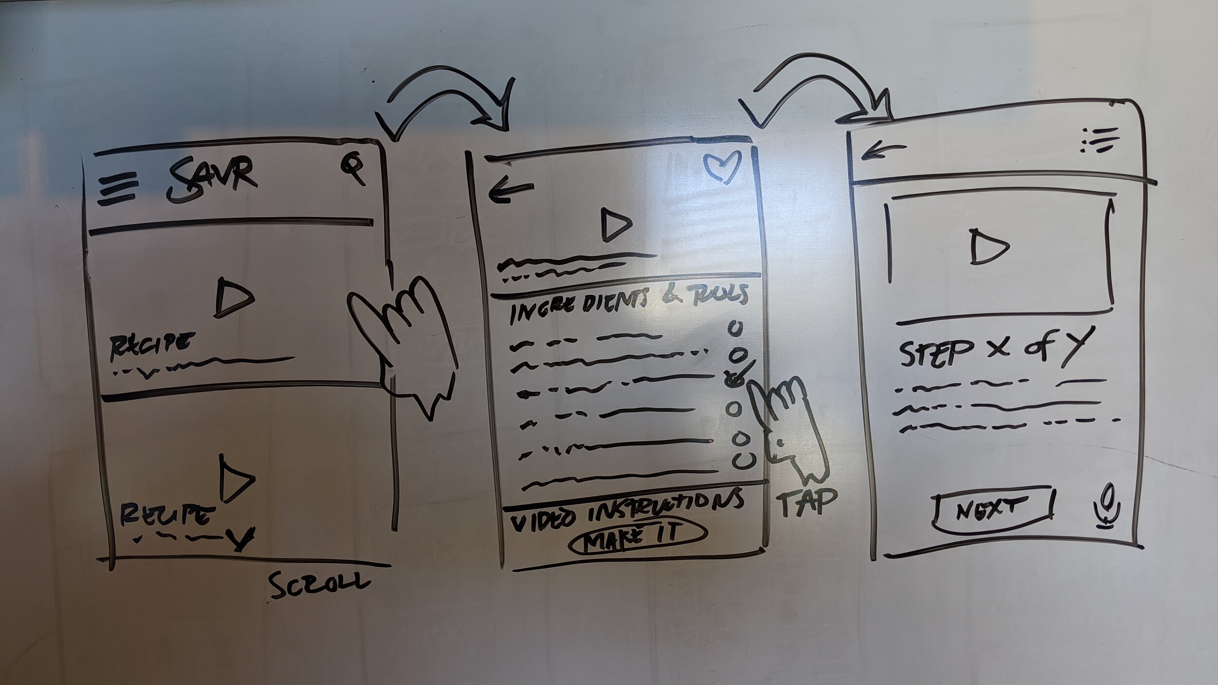
DAY 3: DECIDE
The 9 panel storyboard of how the user flows through Savr. This stage allowed me to refine my ideas and make them more clear.

DAYS 4 & 5: PROTOTYPE & TEST
PUTTING IT TO THE TEST
In my usability testing I asked users to explore the application to find a recipe they might want to try out. Users were able to navigate through the features, but most of the users asked for some additional features to really fine tune what they would see on their home screen and in a search. Users were confused by the buttons seen in the recipe landing page, but when I explained that this screen would be covered in onboarding they were okay with what they saw. From that feedback I learned that what I thought would be clear was not designed the best it could be and there were too many buttons on some screens. In addition, users found issues with the font sizes and the color when it overlaid the images. I addressed the interface issues in a few ways. Firstly, by explaining to the users that short videos would be looping when hovering over each recipe card. Secondly, I added some additional filtering to the search. Then I adjusted some sizing to allow for better readability and touch zones to be larger.
The working prototype
WHAT I LEARNED
I learned to let go and accept that I can't make everything perfect. This design sprint was an incredible experience in learning how to limit myself and how to think more efficiently about solutions. I found that a lot of other at home chefs are experiencing the same frustrations that I am in the kitchen. We all just want to feel confident in the skills we learn and the dishes we are creating. No one wants to deal with food bloggers life story before getting to a recipe so I wanted to really focus on making Savr a beautiful and clean solution for home chefs. Giving everyone the confidence to cook feels good and I really look forward to continuing this project and making it a full on cooking experience.
THE FUTURE OF SAVR
I got so much feedback from cooks of all varieties in my research so I will be adding quite a few features to Savr in the coming weeks. I will add a shopping list feature that pairs with a grocery partner like Whole Foods or the like. A pantry option so users can know what they have in the kitchen. A recipe scanner so you can add foods to your pantry in just a few taps. I want Savr to have the ability to tell you when your produce is likely to go bad and recommend recipes around those ingredients to reduce food waste. I think Savr might turn into a passion project that gets improved for a long while. This is an experience so close to my heart that I believe I can continue to improve it. Check back soon to see how far we've come and leave your feedback!